LOESS is a classic non-parametric regression technique. One potential issue that arises is that LOESS fits depend on several hyperparameters (i.e., parameters set by the experimenter a priori). In this post I’ll take a quick look at how to set these.
At each point in a LOESS curve, the y-value is derived from a local, low-degree polynomial weighted regression. The first hyperparameter refers to the degree of the local fits. Most users set degree to 2 (i.e., use local quadratic curves), and with good reason. At degree 1, you’re just computing a local average. Higher degrees than 2 (e.g., cubic) tend to not have much of an effect.
The other hyperparameter is “span”, which controls the degree of smoothing. A value of 0 uses no context and a value of 1 uses the entire sample (so it will be similar to fitting a single quadratic function to the data). The choice of this value has a major effect on the quality of the fit obtained:
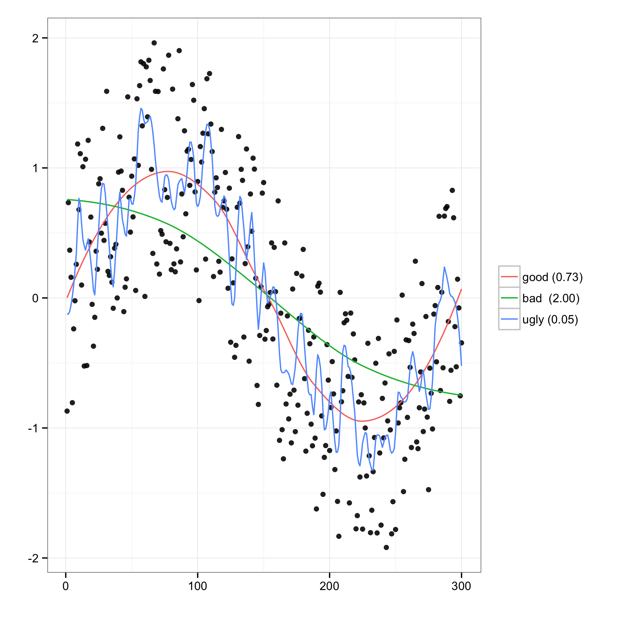
For the randomly generated data here, large values of the span parameter (“bad”) produce a LOESS which fails to follow the larger trend, whereas small values (“ugly”) primarily model noise. For this reason alone, the experimenter should probably not be permitted to select the span hyperparameter herself.
Fortunately, there are several objectives used to determine an “optimal” setting for the span parameter. Hurvich et al. (1998) propose a particularly privileged objective, namely minimizing AICC. This has been used to generate the “good” curve above. Here’s how I did it (adapted from this post to R-help):
There is also an R package fANCOVA which apparently includes a function loess.as which automatically determines the span parameter, presumably similar to how I’ve done it here. I haven’t tried it.
PS to those inclined to care: the origins of memetic, snarky, academic “X without tears” is, to my knowledge, J. Eric S. Thompson‘s 1972 book Maya Hieroglyphs Without Tears. While I have every reason to believe Thompson was poking fun at his detractors, it’s interesting to note that he turned out to be fabulously wrong about the nature of the hieroglyphs.